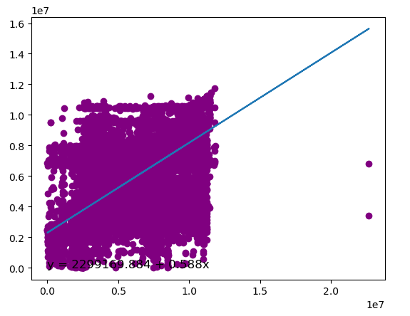
Below, a programme is provided that shows the point cloud with a line that is the best fit to it.
import pandas as pd
import sqlalchemy as sa
import matplotlib.pyplot as plt
import numpy as np

table_name = 'MIGRATED_DIVORCE_SETTLEMENT__C'

connection_string = "DRIVER={ODBC Driver 17 for SQL Server};SERVER=DESKTOP-8J58OIP\MSSQLSERVER_19;DATABASE=Speel;UID=sa;PWD=**"
connection_url = sa.engine.URL.create("mssql+pyodbc", query={"odbc_connect": connection_string})
engine = sa.engine.create_engine(connection_url)
with engine.begin() as conn:
    df = pd.read_sql_query(sa.text("SELECT * FROM Rapportage." + table_name), conn)

onderzoek = df[['Person_ID_1__c','Person_ID_2__c']].apply(pd.to_numeric).dropna()
print(onderzoek.info())
print(onderzoek.head())

y = onderzoek['Person_ID_1__c']
x = onderzoek['Person_ID_2__c']

#add points to plot
plt.scatter(onderzoek['Person_ID_2__c'], onderzoek['Person_ID_1__c'], color='purple')
a, b = np.polyfit(onderzoek['Person_ID_2__c'], onderzoek['Person_ID_1__c'], 1)
plt.plot(onderzoek['Person_ID_2__c'], a*onderzoek['Person_ID_2__c']+b)
plt.text(1, 90, 'y = ' + '{:.3f}'.format(b) + ' + {:.3f}'.format(a) + 'x', size=12)

print('**********programma beindigd****')